
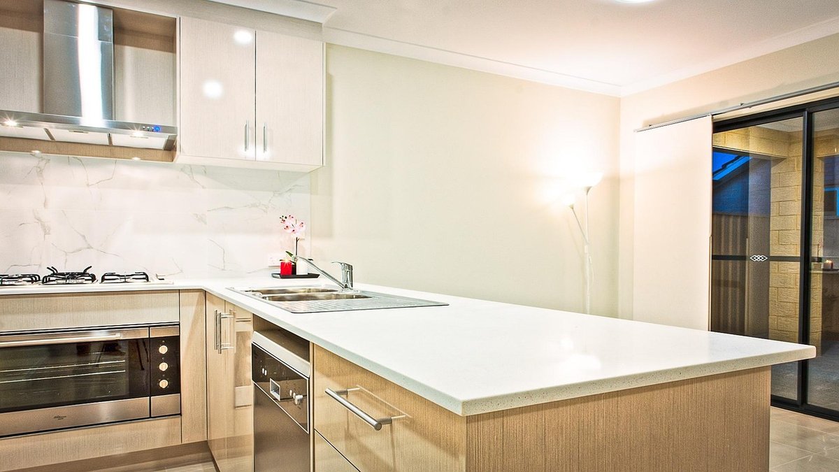
A south-facing kitchen is the room everyone wants. You get morning light that arrives early, a long stretch of bright, honeyed sunshine through the middle of the day, and a soft, lingering glow in the late afternoon. The trade-off is that this light is not neutral. It carries warmth, and a good deal of it. From roughly 11am until 3pm in summer, the light in a south-facing room is strong enough to wash out pale colours, exaggerate anything with a yellow base, and make a cream wall read almost gold.
That is why the paint colours that look perfect in a north-facing showroom can feel heavy, chalky or just plain wrong once they are up on your walls. Choosing paint for a south-facing kitchen is less about picking a fashionable shade and more about understanding how sunlight will alter it hour by hour.
Because the light itself supplies the warmth, the walls do not need to. Cool and cool-leaning colours act as a counterweight, keeping the room feeling fresh rather than hot and slightly overripe by mid-afternoon. Blue-greys, soft greens and greyed-off neutrals are the most reliable choices here.
Duck egg blue, weathered grey and muted teal all sit comfortably in this family. The unifying rule is simple: if a colour looks slightly cool and slightly greyed on the sample card, the sun will bring it to life.
There is no such thing as a banned colour, but some shades need more thought in a south-facing kitchen.
Warm neutrals are not off the table, but shift the balance — choose a greige with a grey rather than a yellow undertone, and keep the warmest shades for north-facing corners or cupboards.
This is the step most people rush, and it is the one that saves the most money. A paint chip in a shop tells you almost nothing about how a colour will perform in your kitchen.
Remember that matt and eggshell finishes read differently, so test the sheen you actually intend to use.
Colour is only half the story. A matt emulsion on the walls absorbs light and softens glare, which suits a bright south-facing room well. An eggshell or washable matt is more practical around a hob and sink. Satin on woodwork gives a gentle bounce that picks out architraves and window frames, while a soft sheen on the ceiling helps daylight travel deeper into the room. Glossy worktops and a tiled splashback will throw light around too, so factor those surfaces in when you judge a colour.
Once your wall colour is settled, let the cabinetry, worktops and flooring do the softening. Pale oak, ash or warm-toned timber grounds a cool grey-green beautifully, while white or pale grey units keep the space feeling open. Add a few darker notes — handles, a pendant, a run of open shelving — to stop the scheme floating away. Finally, layer in texture: linen blinds, woven baskets, a bowl of lemons. In a south-facing kitchen, the light is the star, and the right paint is simply the frame around it.

Hi, my name is Anthony kuber. I am artist and fashion designer.
I love to travel and writing blogging.
Your email address will not be published. Required fields are marked *
Software Developer & Writer
Hey, I'm Diva, a developer and writer blending code and creativity. I'm driven by a deep curiosity and a relentless pursuit of excellence. Join me as I craft digital solutions and captivating stories.


